Project:

Dealing in trust: Establishing Topdeck 126's first brand identity and online store
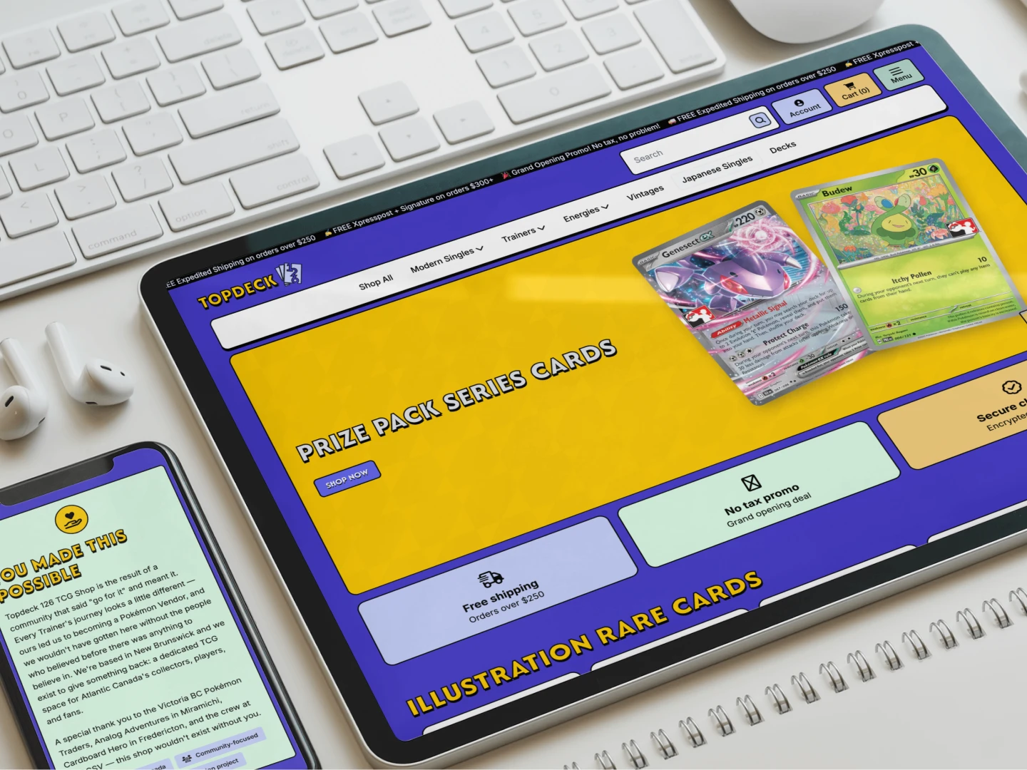
As the designer and developer at Roxann Creates, I led the Topdeck 126 project from concept to launch. I created the shop's first-ever brand identity and its first online store: a modern logomark, a cohesive color palette, a type system, and a WooCommerce storefront that turns thousands of trading cards into something shoppers can browse, filter, and buy with ease. The goal was a store that feels as credible as the national retailers while keeping the community-first warmth that makes Topdeck 126 worth supporting.
Image

TL;DR

The goal was to launch Topdeck 126 with a modern brand and an online store that could stand next to the big national retailers, while keeping its community-first personality. Here is how the first four weeks after launch landed.
416 Active Users
421 New Visitors
68.6% Engagement Rate
~76% Mobile Audience
83% Local (Canadian) Reach
2.1% Category Bounce Rate
First four weeks post-launch (June 17 to July 14, 2026), via Google Analytics 4.

Discovery

Empathy: understanding the shop, the shopper, and the stakes.

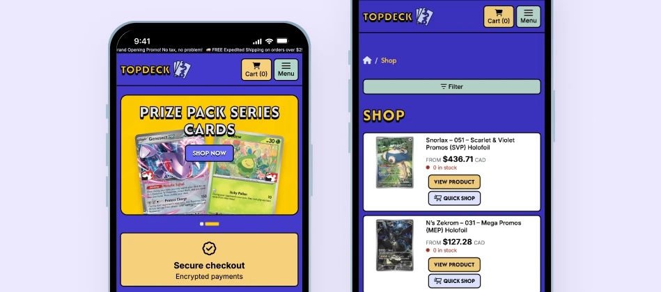
Before touching a pixel, I mapped out who this store is for and what gets in the way of a smooth sale. Topdeck 126 serves two overlapping crowds: collectors hunting specific cards by set, rarity, and finish, and competitive players building decks who need trainers, energies, and singles fast. Both are used to big marketplaces, so their expectations for search, filtering, and checkout are already high.

The core challenge is the catalog itself. This is not fifty products, it is thousands of near-identical items separated by tiny but crucial details: set, rarity, condition, finish, and stock count. And because the shop grew out of a local passion project, the brand had to stay warm and grassroots while still looking legit enough to trust with a credit card.
Image
Look the part
A brand that reads as credible right beside national retailers.
Browsable at scale
Thousands of cards that stay easy to find and filter.
Mobile-first
A fast, thumb-friendly experience for phone shoppers.
Client-run
A fast, thumb-friendly experience for phone shoppers.
Image

Design

Insight: a bright, trustworthy identity and an interface built for the dig.

Before touching a pixel, I mapped out who this store is for and what gets in the way of a smooth sale. Topdeck 126 serves two overlapping crowds: collectors hunting specific cards by set, rarity, and finish, and competitive players building decks who need trainers, energies, and singles fast. Both are used to big marketplaces, so their expectations for search, filtering, and checkout are already high.

The core challenge is the catalog itself. This is not fifty products, it is thousands of near-identical items separated by tiny but crucial details: set, rarity, condition, finish, and stock count. And because the shop grew out of a local passion project, the brand had to stay warm and grassroots while still looking legit enough to trust with a credit card.

Brand identity

The identity needed to feel energetic and playful, a nod to the joy of cracking packs, without tipping into childish. The palette carries most of that balance: bright yellow for the fun, grounded indigo for the credibility.
Image
Primary Brand

Topdeck Yellow
#FFCC00

Accent

Indigo
#4F46E5

Logomark tint

Periwinkle
#C7D2FE

Text & structure

Black
#000000

A clean, minimal logomark anchors the system. It scales from favicon to hero banner, stays recognizable at any size, and never competes with product imagery.

Typography

Aa Bb Cc

Afacad Flux
handles display and headings, bringing a modern, characterful voice to the top of every page.

Aa Bb Cc

Inter
does the heavy lifting everywhere legibility matters most: condition labels, price tags, quantity selectors, and filters stay crisp at small sizes. Expressive face for character, neutral face for the hardworking details.

UX and information architecture

Navigation was built around how players think, not how a database is organized. Set and rarity act as the primary filters because that is the language shoppers already speak, with condition, finish, and quantity handled at the product level. The result: someone can go from "I want a Special Illustration Rare from Scarlet & Violet" to cart in a few taps.
Quick Shop
Add to cart without losing your place in a long grid.
Clear variants
Condition and finish shown right at the buying moment.
Calm product grids
Generous spacing keeps prices and labels scannable.
Trust-building flow
Homepage moves from offers, to arrivals, to community.

UI and visual design

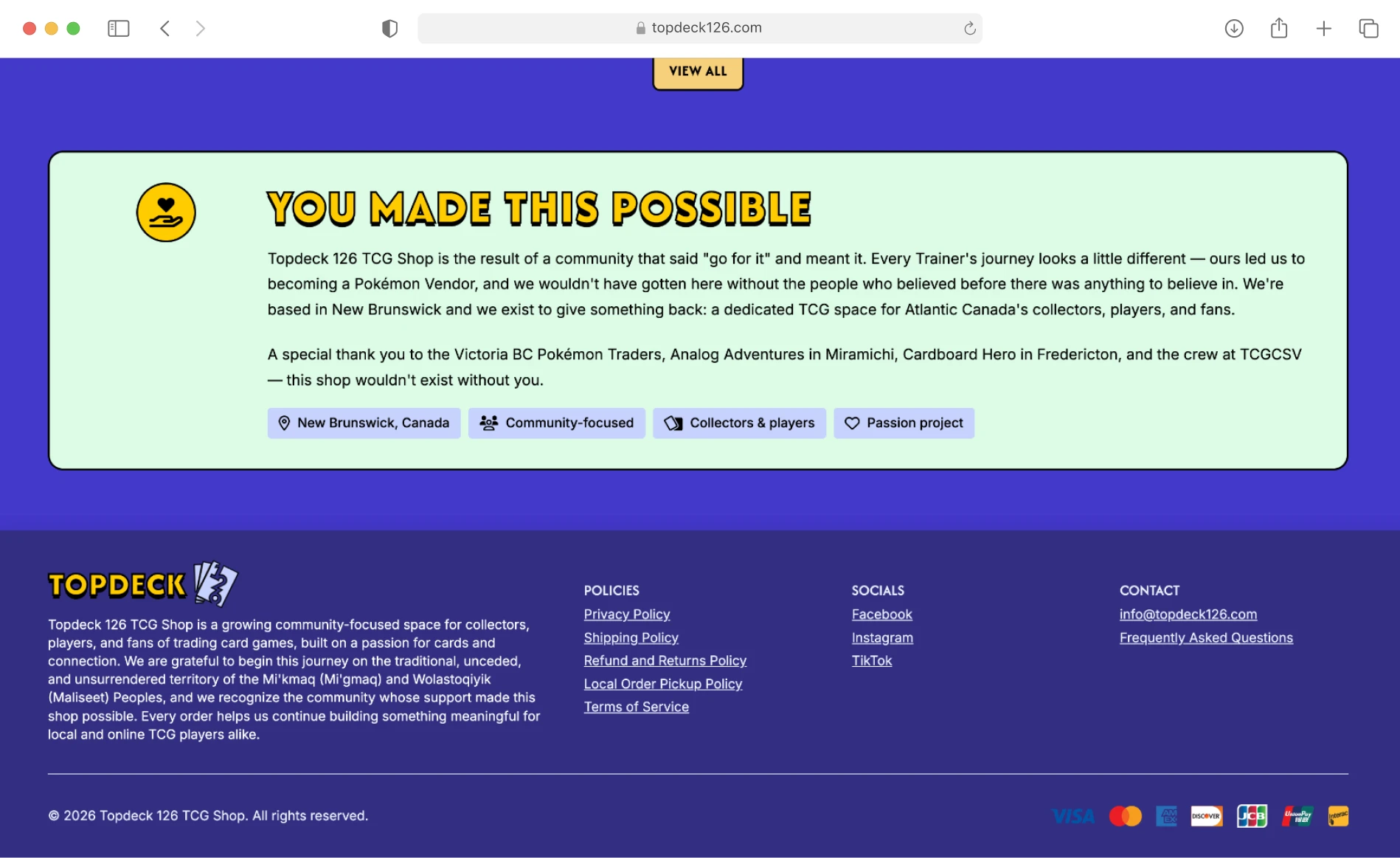
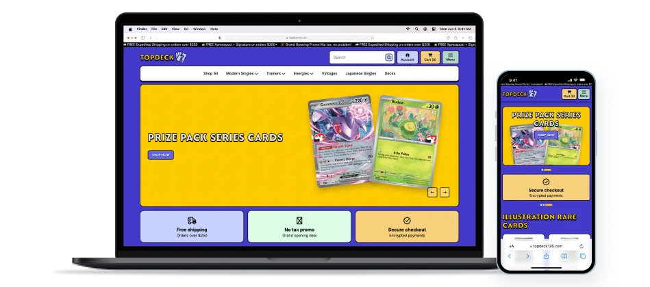
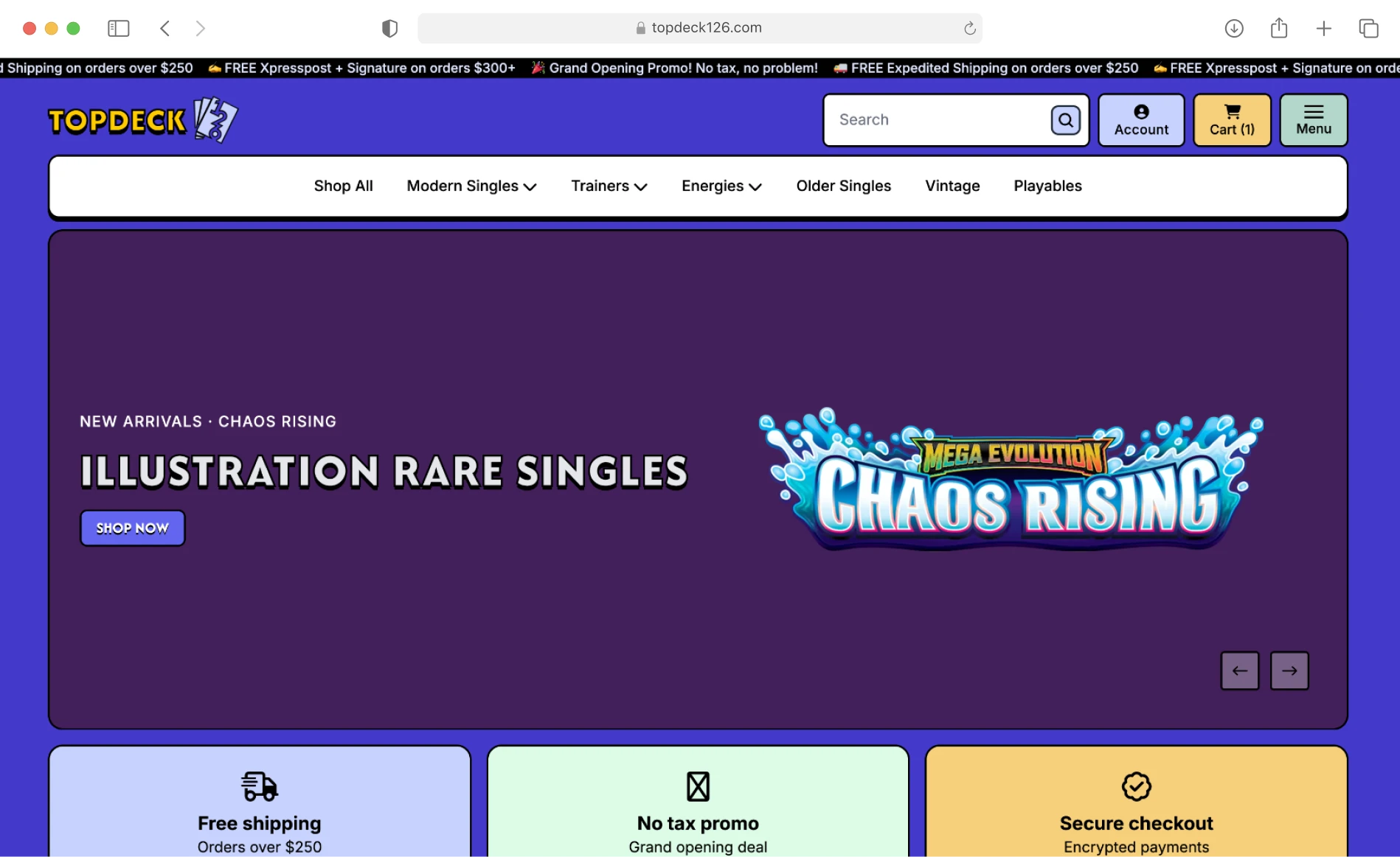
The homepage is sequenced to build momentum in one scroll: a promo banner with the launch offers, a new arrivals carousel, featured collections that double as entry points, and a "You made this possible" community close. Mobile got equal weight from the start, with touch-friendly targets, thumb-reachable filters, and fast-loading grids treated as core requirements.
Image

Develop

Building a store that stays fast and manageable at catalog scale.
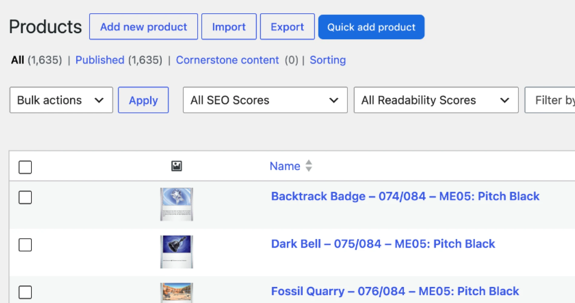
The store runs on WordPress with WooCommerce, chosen so the client truly owns it. Topdeck 126 can add products, adjust pricing, and manage stock without a developer on call, which matters for a shop whose inventory shifts daily.
Image
Scalable catalog
Set, rarity, condition, and finish taxonomies keep thousands of SKUs filterable.
Smart variants
One listing carries condition and finish options with independent stock.
Fast checkout
Streamlined cart and secure checkout with the launch promo logic built in.
Performance-minded
WebP imagery and a responsive build keep image-heavy grids quick on mobile.

Deploy

Transformation: launch, results, and what the shop can grow into.
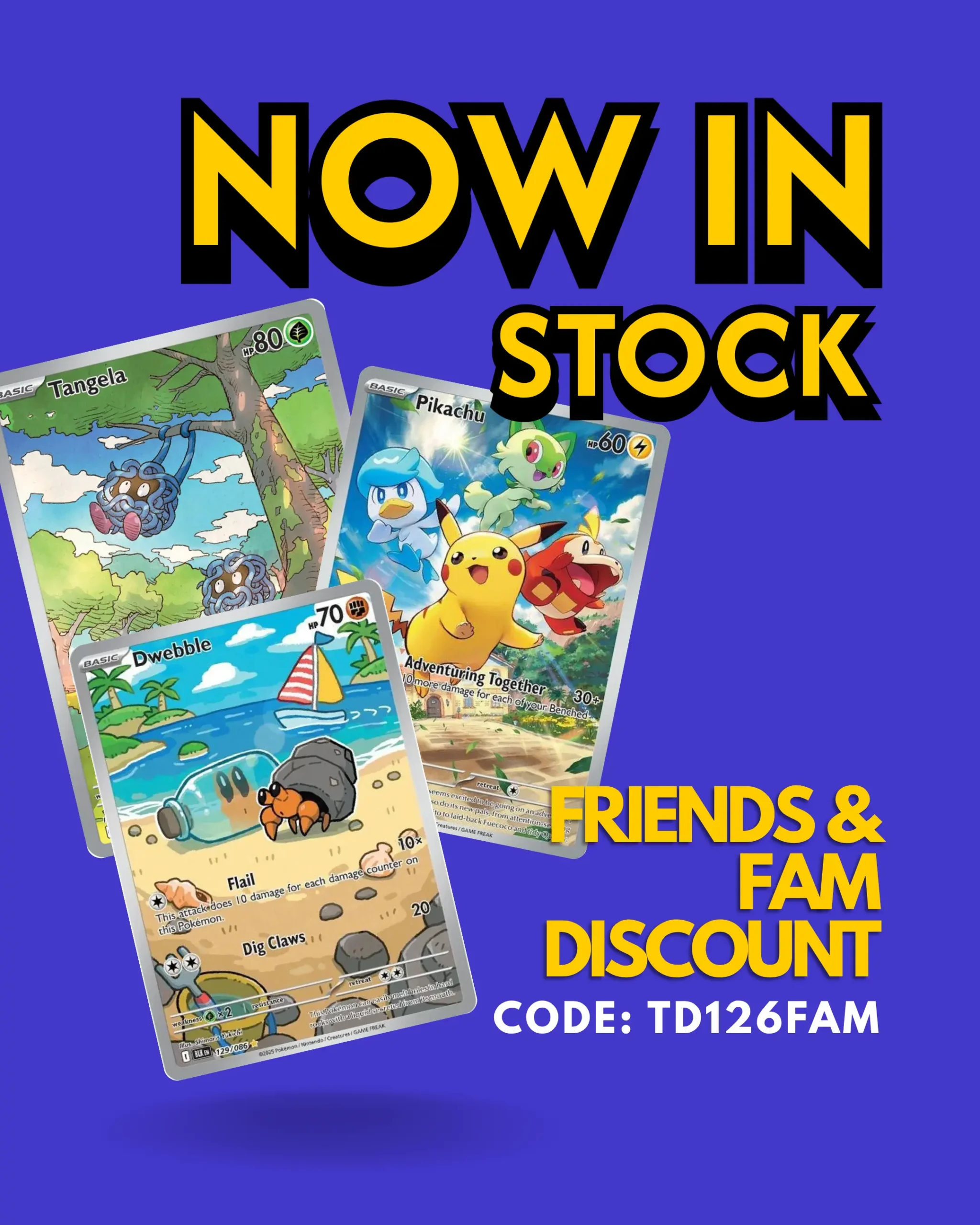
The site went live as a full storefront, timed with a grand opening push (tax-free promo and free expedited shipping over $250) that gave first visitors a reason to buy on day one.
Image

Results

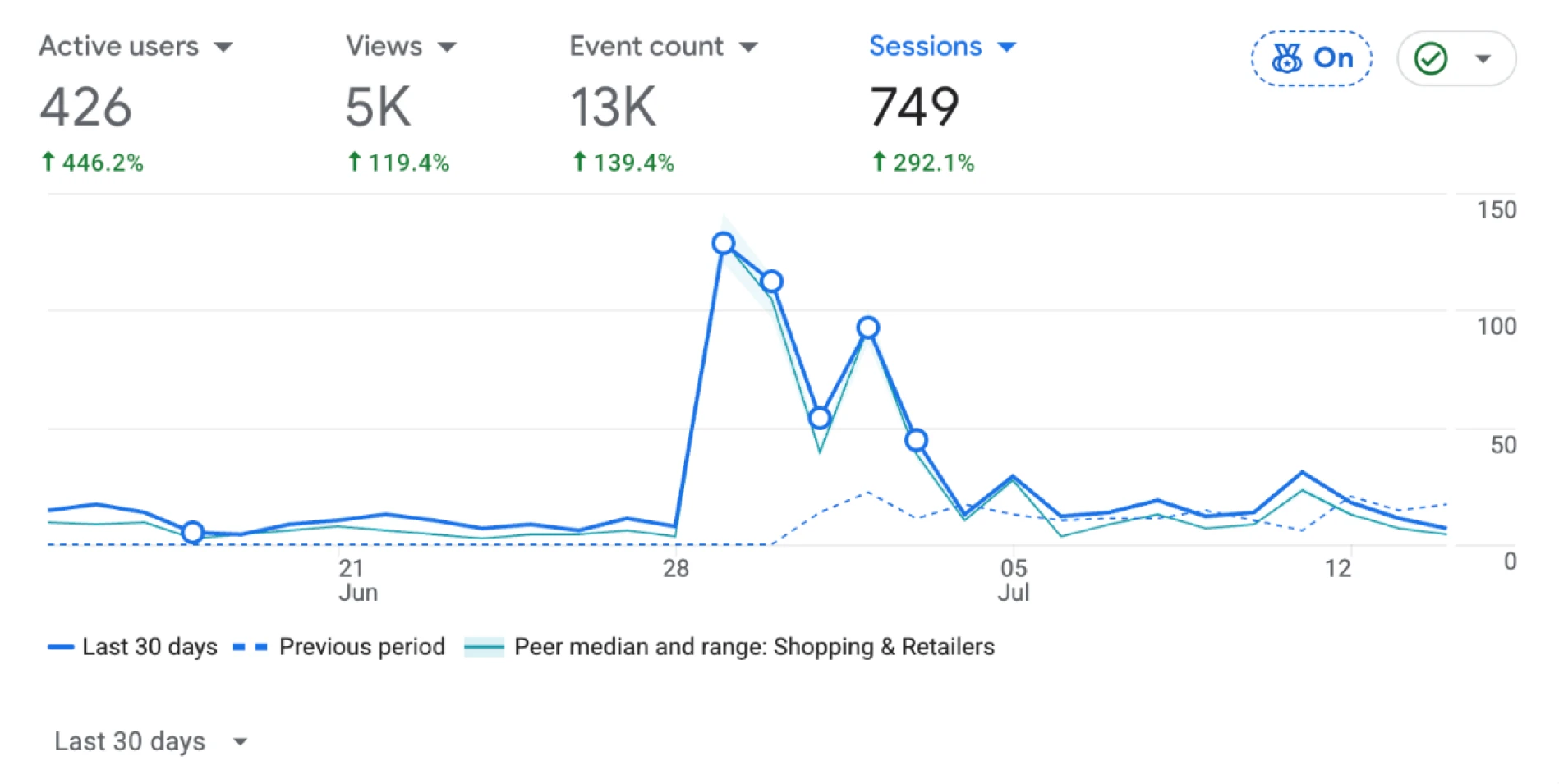
Reporting window: June 17 to July 14, 2026. Source: Google Analytics 4.
In its first month, the store drew 416 active users and 421 new users, nearly all first-time visitors. More telling than the raw traffic is how they behaved: they stuck around, browsed deep, and moved toward checkout.
416 Active Users (first 4 weeks)
A healthy launch audience for a brand-new local shop
83% Canadian traffic share
The local, Atlantic-Canada-first positioning is hitting the right market
~76% Mobile traffic share
Validates the mobile-first design decision
68.6% Engagement rate (Canada)
Above the ~55% e-commerce norm, real engagement not bouncing
2 min 56 sec Avg. engagement time
26.9% Homepage bounce rate
Low for a homepage, the trust-building flow is working
Image

Client outcome

Topdeck 126 launched with a storefront that looks credible next to national retailers while keeping its community-driven warmth. The identity is bright and memorable, the catalog is genuinely browsable at scale, and the client has a store they can run and grow themselves.
Image
Image
Image
Image

The takeaway

The heart of this project was one balancing act: make a massive, detail-heavy catalog feel effortless, without sanding off the personality that makes a local shop worth supporting. That came down to disciplined information architecture, a color and type system that carries both fun and trust, and a build that puts control back in the client's hands. Bright where it should be bright, clear where it needs to be clear, and human all the way through.
View Website